Peignot (typeface) – Wikipedia
From Wikipedia, the free encyclopedia
Typeface
Typeface
Peignot (pronounced Pen-yoe) is a sans-serif display typeface, designed by the poster artist A. M. Cassandre in 1937.[1] It was commissioned by the French type foundry Deberny & Peignot.[2]
The typeface is notable for not having a traditional lowercase, but in its place a “multi-case” combining traditional lowercase and small capital characters.[2] Cassandre intended for Peignot to be used in publishing and stated that “[t]here is no technical reason in printing why we cannot return to the noble classical shapes of the alphabet and discard the lower case forms.”[1]
The typeface achieved some popularity in poster and advertising publishing from its release through the late 1940s. Stylistically Peignot is a “stressed” or modulated sans-serif in the Art Deco style, in which the vertical strokes are clearly wider than the horizontals. Use of Peignot declined with the growth of the International Typographic Style, which favored less decorative, more objective, traditional typefaces such as Akzidenz-Grotesk.
Peignot experienced a revival in the 1970s as the typeface used on The Mary Tyler Moore Show (and its production company, MTM Enterprises) and the second season of That’s My Mama. While often classified as “decorative”, the face is a serious exploration of typographic form and legibility. It is now owned by Linotype Corp. and is distributed by both Linotype and Adobe.
A very similar typeface, Chambord by Roger Excoffon, was released by the Fonderie Olive in Marseille in 1945; it had a traditional lowercase.[2] A font resembling Peignot was used for the Intellivision video game system. Derek Vogelpohl distributes a digital version of that font as freeware under the name SF Intellivised.


- Lady Chatterley’s Chopped Liver And Other Recipes paperback cover spoof in Mad Follies #1 (1963)
- The titles throughout the Beatles’ 1965 film Help!
- The Random House hardcover edition of Philip Roth’s novel When She Was Good (1967)
- Barbarella theatrical release poster from 1968
- The credits of the 1970 film Love Story
- The cover of the Elton John soundtrack album for the movie Friends (1970), though Peignot was not used on the materials for the movie itself
- Out-of-home advertising firm Fairway Outdoor Advertising used the font for its logo and nameplates from 1992 until the switch to Gill Sans in the company’s 2009 revamp.
- The 1970s toy “Spirotot” used Peignot in its instruction manual
- Behind the Camera: The Unauthorized Story of Charlie’s Angels used Peignot in its titles
- The title graphics of the ABC Movie of the Week from 1969 to 1975
- Everybody Who Was Anybody: A Biography of Gertrude Stein by Janet Hobhouse in 1975
- The closing credits for the 1976 film The Pink Panther Strikes Again
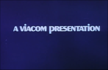
- The original “pinball” logo used by Viacom Enterprises (ca. 1971–1976)
- Quinn Martin’s Tales of the Unexpected (1977)
- The Gordon Institute of Business Science logo
- The final branding of Republic Airlines prior to their merger with Northwest in 1986
- The closing credits taken from the music show Solid Gold from 1982 to 1985
- The logo for the British software development company Novagen Software
- The logo for the 1980s game show Dream House
- Lifeforce, title sequence for the 1985 film
- Shanghai Surprise, the 1986 film
- The cover of Spandau Ballet’s 1986 album Through the Barricades
- Several Muppets films use Peignot for their title sequences
- The Mary Tyler Moore Show opening title and end credits sequences
- That’s My Mama second season opening title sequence
- The Jerry Springer Show used Peignot for its first three seasons (1991–1994)
- Real Madrid’s shirt number and name font in 2005–06 season
- The Oprah Winfrey Show fantasy opening title sequence
- Gary Larson’s The Far Side and The Far Side Gallery
- The Boo Radleys’ album Giant Steps and accompanying singles
- The font on the back cover of Big Star’s debut album #1 Record
- “Magic Tree” car air fresheners
- The logo of Easy Living magazine
- Universidade Estadual de Londrina
- Radio Philippines Network
- Baltimore Police Department cars
- More recent paperback editions of F. Scott Fitzgerald’s The Great Gatsby use Peignot to spell out Fitzgerald’s name
- Signage for Nashoba Valley Ski Area in Westford, Massachusetts
- The logo of Igloo Products Corporation
- The puzzleboard font from 1996 to 2006 for Wheel of Fortune Australia
- Menu and interface elements in some games of Touhou Project
- The credits of the primetime soap opera Flamingo Road
- The closing credits of the game show Play the Percentages
- The original logo of Holyoke Mall at Ingleside[3]
- Olivia Newton-John’s album, The Definitive Collection from 2001
- The Magnetic Fields’ album and tour graphics for 50 Song Memoir in 2017
- The captions of web television series Mind Field
- The Peignot font was used on Red FBI Warning Screens from Disney tapes.
- Carroll Fulmer uses the font on the side of its fleet of tractor trailers and in their advertising.[4]
- WWJ-TV (now called WDIV-TV) logo from 1976 to 1978
- The Atari Jaguar motorcycle racing game Super Burnout used this font in the menu screens.
- Ginette Reno’s album, “Beautiful Second Hand Man” from 1971.
- Front cover of “Youthquake”, an album by Dead or Alive from 1985
- Front covers of both “Experience”, the debut album from The Prodigy (1992), and the following album “Music for the Jilted Generation” (1994).
- The previous Dollar Tree logo, used from 1993 until the 2000s.
- The closing credits from the 1995 movie Get Shorty (film).
- Logotype for “General Foods International Coffees” 1970s.
- Credit sequence for Encanto
See also[edit]
References[edit]
External links[edit]
Recent Comments